Fun One Star Reviews Graphics

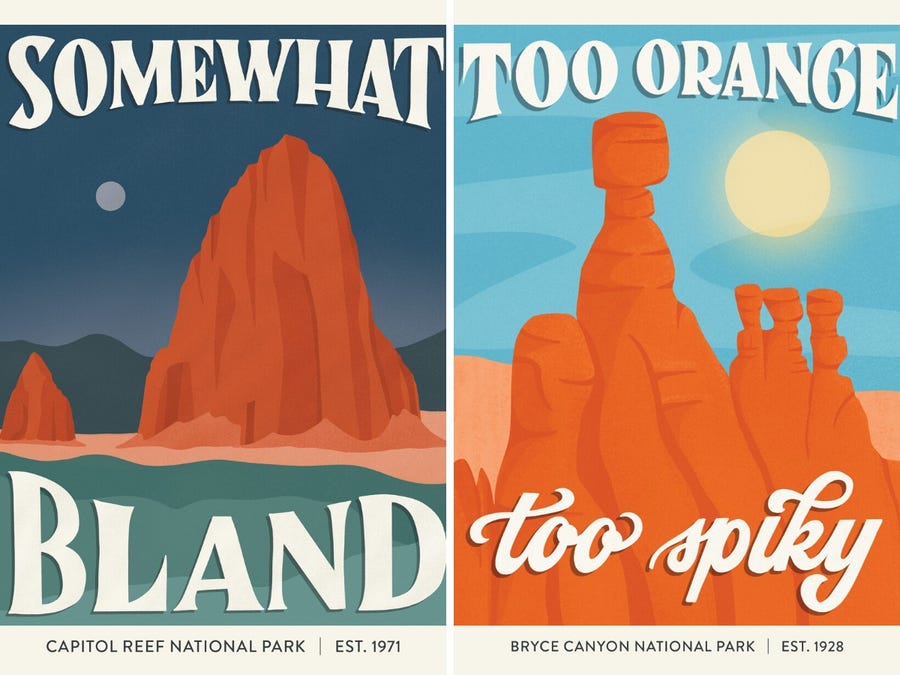
A graphic designer takes one-star reviews of national parks and turns them into fun works of art … meet Amber Share!
It’s hard to imagine someone visiting one of America’s greatest outdoor treasures and leaving unsatisfied, yet buried in countless positive reviews for national parks are a few negative ones.
The Petrified Forest National Park in Arizona is “basically a desert with some dead trees,” according to one review.
A visitor to the Everglades National Park in Florida felt there were “miles and miles of nothing.”
“The only thing bad about these lands is the entire experience,” someone wrote about Badlands National Park in South Dakota.
Amber Share, a graphic designer, decided to put a humorous spin on these negative reviews of national parks
Share takes one-star reviews and uses bold colors, artistic lettering, and engaging imagery to create posters for each park.
Share has illustrated 52 of the 62 US national parks, and quickly gained nearly 200,000 Instagram followers.
The graphic design professional told Insider the response has been overwhelming.
“I think there’s so much negativity in the world right now,” Share said. “And I get a lot of messages that people love how I’m turning a negative thing on its head a bit.”
The posters started as a passion project last fall. Share’s love for nature and her desire to create a name for herself in the outdoor industry inspired her to illustrate national parks.
“I didn’t want it to be straight national park illustrations because that’s been done a lot and I felt like it would really just be white noise,” she said. “I wanted there to be a humorous angle to it because I’m just a very snarky person in general.”
After stumbling upon a Reddit post where someone had rounded up a few bad national park reviews, the idea clicked for her project
“It was just a lightning bolt moment,” the 31-year-old said. “That’s it. That’s what I’m doing.”
Her first design was inspired by a review of Arches National Park in Utah that claims it “looks nothing like the license plate.”
Share said she looks at photographs from the national parks to gather the “core essence” she’s trying to depict. Her style is minimalistic and she employs shapes and shadows to create depth within each image. She told Insider that each design takes around five hours.
What had started as a passion project last fall is now Share’s full-time job. She said her account really took off after she shared her work with Reddit groups, national park accounts, and other park rangers.
With her wide reach, Share has also released postcards, prints, and stickers with the designs.
The graphic designer has just 10 US parks left, but she doesn’t plan to stop her illustrations. Once she’s completed those, she said she plans to illustrate international parks.


